We recently wrote about colour trends for 2021, including various companies’ Colour of the Year. To get a full picture of upcoming colours, make sure you check out that post too. A couple of manufacturers and, importantly, Pantone had not released their Colour of the Year at that point. So, here we bring you an update on which colours the experts think we’ll be using in 2021. There is an overriding theme of warmth, comfort and reassurance – unsurprising after the year we’ve just had.
Farrow & Ball
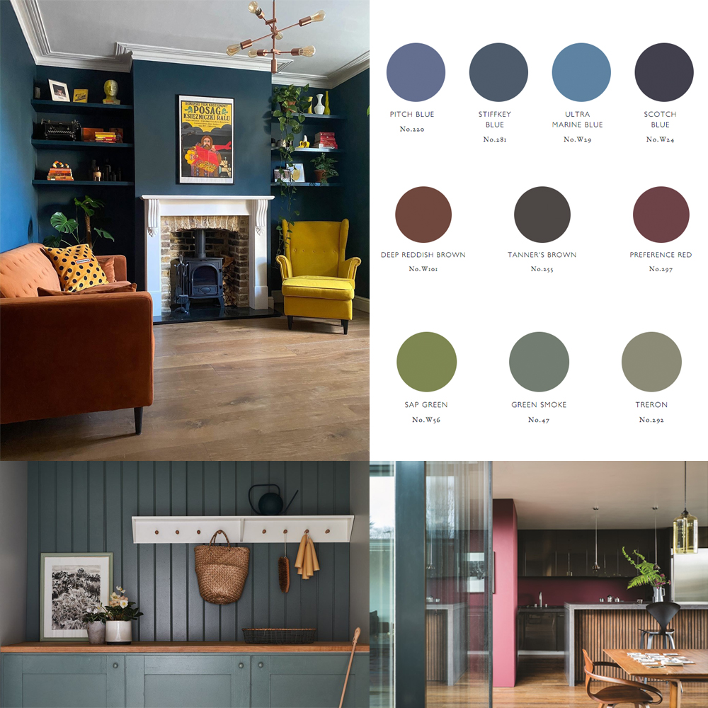
Farrow & Ball don’t just have a single colour of the year. They prefer to choose palettes of the colours they predict will be popular for the coming year. So far, they have released 3 of their 4 palettes; Earthy Autumnals, Timeless Blues and Natural Greens.
Earthy Autumnals
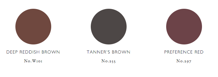
Farrow & Ball’s Colour Curator Joa Studholme explains, “In challenging times we crave warm tones that create cosy sanctuaries away from the outside world”. As we will still be spending more time in our homes for some time to come, this feeling of sanctuary is important. We want to relax and feel comforted by our surroundings. This earthy palette uses warm earthy browns and soft reds but also includes warm mustard and a brighter, more optimistic shade of aubergine.

Timeless Blues
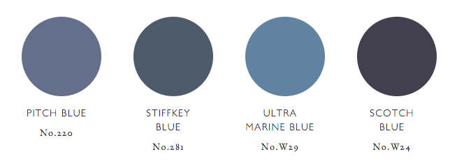
Blue is always there in interior design. It never goes out of fashion. In 2021, Farrow & Ball are predicting a subtle shift towards clean, uncomplicated blues. These are at the warmer end of the blue spectrum, hues that feel familiar and create a soothing effect in our homes. These timeless blues are versatile, whether you have a formal or a contemporary interior, giving them longevity and an enduring appeal.

Natural Greens
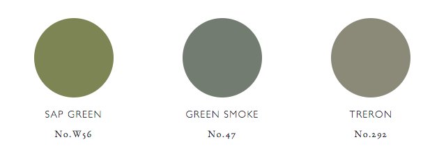
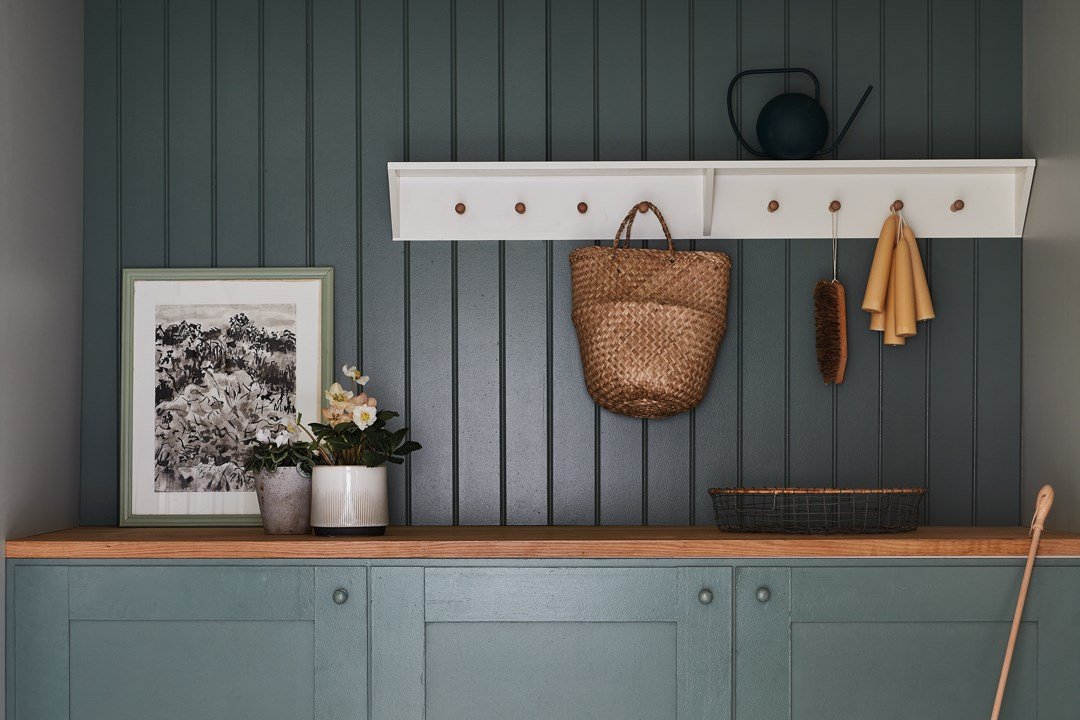
Greens have been on our Trends lists for some time but, along with most other experts, Farrow & Ball are predicting a move towards the more comforting, natural greens. Less neo mint and more Sap Green. These are soothing, earthy tones that reinforce our connection to nature and evoke feelings of calm. Look for soft, smoky greens with a depth of colour.
Benjamin Moore Colour of the Year 2021

Each year, the experts at Benjamin Moore carefully curate a colour trends palette that balances modern day relevance with long lasting appeal. At the centre is one special colour that defines the mood and the palette. Their Colour of the Year for 2021 is Aegean Teal, together with a palette that radiates warmth and wellbeing. These are comforting, sunbaked colours designed to make your home feel like home. Think of simple pleasures that nourish the spirit. They describe Aegean Teal as deeply soothing – a colour that encourages you to reflect and reset. This palette is all about natural harmony.
Pantone Colour of the Year 2021
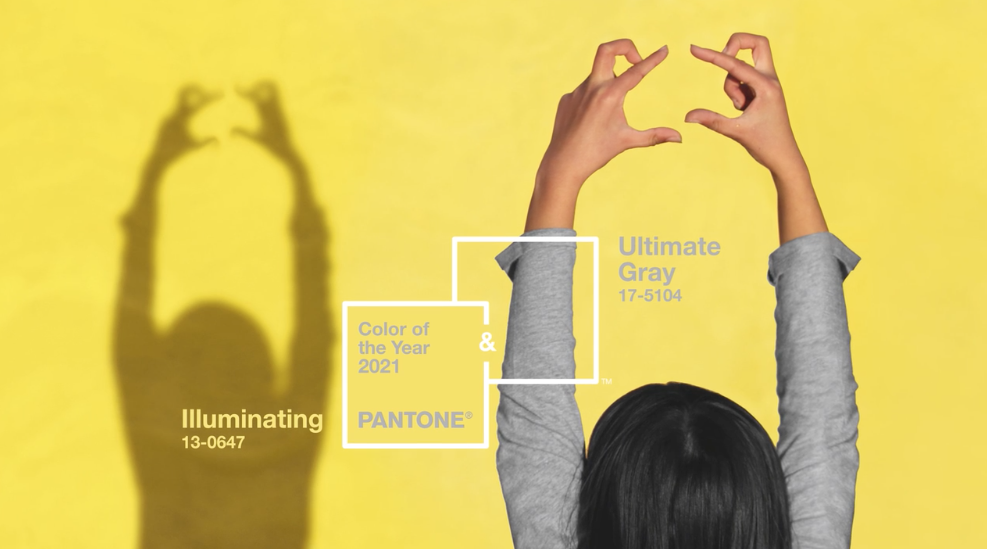
As many of this year’s experts have found, it is very difficult to find one single colour of the year that encompasses everything we want our homes to be right now. So Pantone have released not one but two colours for 2021. Unlike any of the other colour predictions, we would not describe these as warm or earthy. Pantone have gone for Ultimate Gray and Illuminating. Ultimate Gray is what it says, a mid grey but with cooler undertones than we have seen so far. Illuminate is a vivid yellow, again lacking some of the warmth enjoyed by the other palettes featured.
Leatrice Eiseman, Executive Director of the Pantone Color Institute, explains the choice, saying, “The union of enduring Ultimate Gray with the vibrant yellow Illuminating expresses a message of positivity supported by fortitude. Practical and rock solid but at the same time warming and optimistic, this is a colour combination that gives us resilience and hope”. We are yet to be convinced but we’ll wait and see. Let us know what you think. Which colours have made it onto your shortlist for 2021?
I love the new colour collection very inspiring.
Thanks Liz. Quite different to previous trends.