We’ve spoken a lot lately about warm neutrals in our interiors. All colour trend experts agree that the interior design world is moving away from the ubiquitous grey towards warmer, more comforting shades. And after last year, who isn’t craving a bit of comfort? From Dulux’s earthy Brave Ground to the rich, deep Urbane Bronze by Sherwin Williams, these are colours to make us feel cosy and calm. Check out Colour Trends and Colour of the Year for images and inspiration. But how do we use these warm neutrals in our homes without everything looking bland?
Ways to Tackle Warm Neutrals
There are three ways to approach a warm neutral colour scheme: You could opt for a completely neutral colour scheme; your warm neutrals could be simply a backdrop to other stronger or more vibrant colours; or you may have a warm neutral scheme with simple accents or pops of colour. Each has its place in interior design, and how you choose to use warm neutrals is very much a matter of personal taste. More on this in a moment.
Help is at Hand
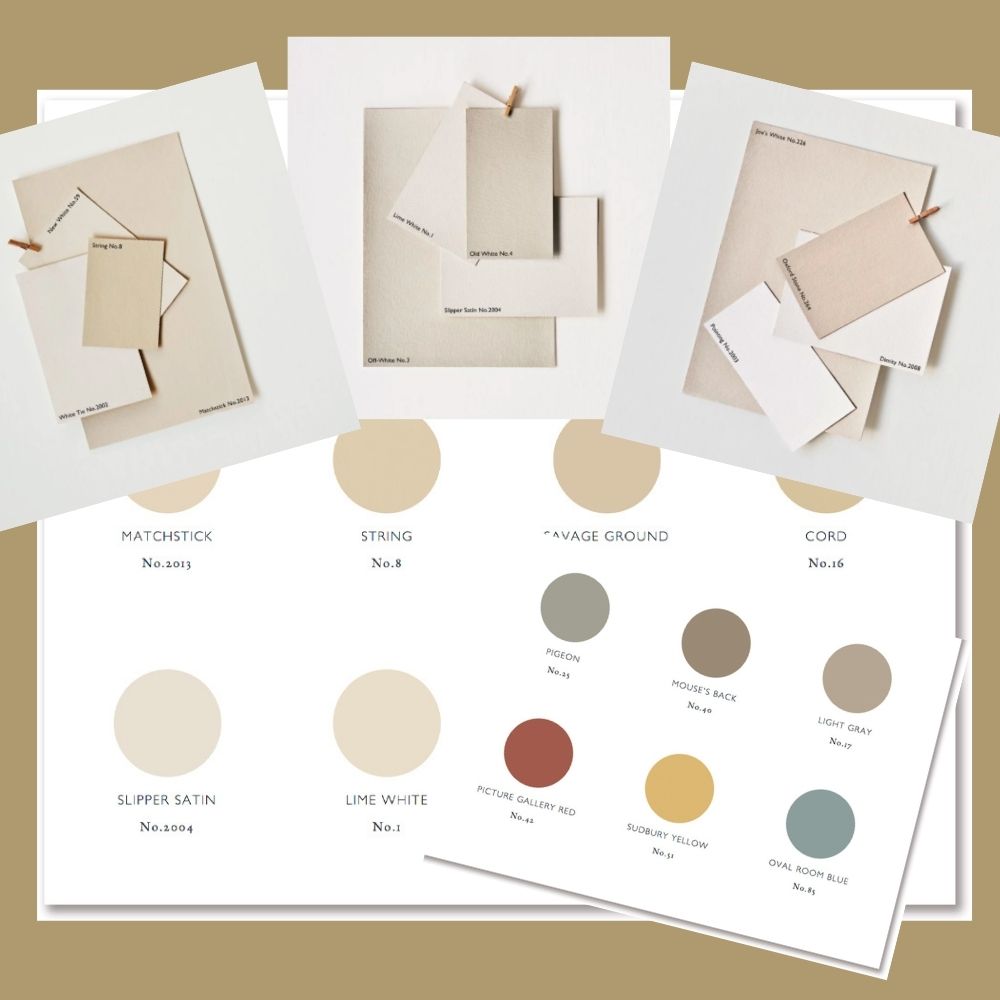
There is an eye-watering array of neutral paints, furnishings and fabrics out there to choose from. If you are worried about how to combine them, two of our favourite paint companies, Farrow & Ball and Little Greene, have edited their neutral collections into harmonious groups to make choosing your colours and accents almost foolproof. Their colour experts have collected them into families depending on their base colour.

Warm Neutral Bases
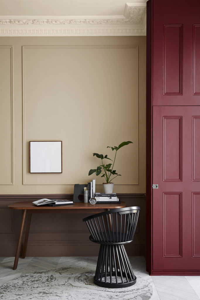
Little Greene’s new Stone Collection includes six groupings divided according to undertone – Red Ochre, Burnt Sienna, Yellow Ochre, Burnt Umber, Lamp Black and Green Earth. Farrow & Ball have both cool and warm Neutral Groups, the warm neutrals being Traditional, Yellow-Based and Red-Based. Whichever palette you choose, you know from the outset that all the colours within that group will work together. They also include accent colours that will work with each of the warm neutral palettes. This is a really clever and helpful idea. Not only are the colours absolutely gorgeous, but half the work is already done for you.
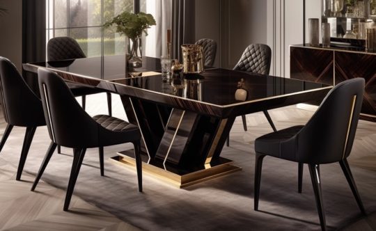
A Warm Neutral Colour Scheme
A completely neutral colour scheme is restful and tranquil. Walls, floors, furniture and soft furnishings should all be different tones of your warm neutral base. This can be pale throughout and almost ethereal or you may prefer to bring in some of the deeper neutral shades from the same palette to add more depth and interest. Of course, what you don’t want is to run the risk of it all looking a bit flat.
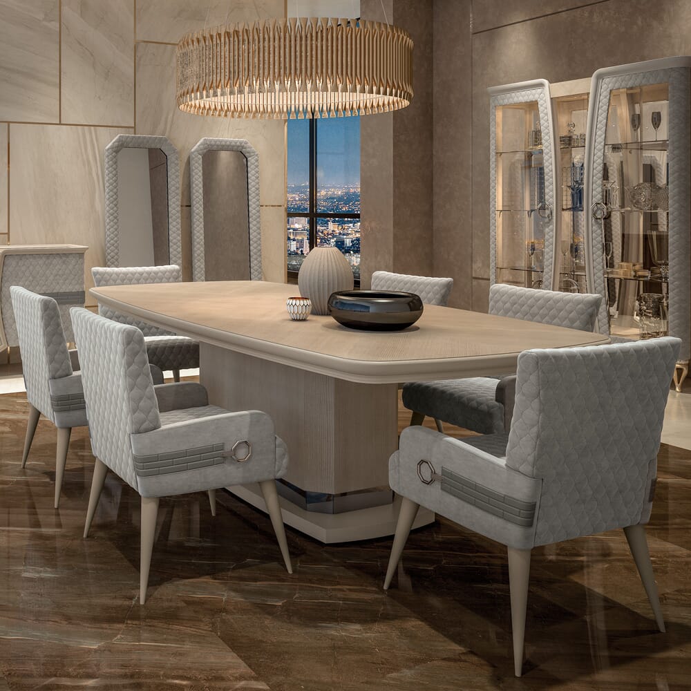
Texture, Texture, Texture
The trick here is to add texture, and lots of it. Layer different textures to add depth and dimension. Look for textures that absorb light and ones that reflect. Explore some of the range of innovative wallcoverings available. Think carefully about your fabrics. Luxury silks, velvets and damasks give subtle reflections, adding a sense of sophistication. Bouclé, soft nubuck and linen add softness. Knitted throws, fur-type fabrics and luxurious rugs absorb light and bring warmth. Be careful to think of the overall style and the feel you are trying to create. Not all of these textures will go together and you don’t want a jumbled mish mash of ideas. Find the ones that fit with your style and work well as a group.
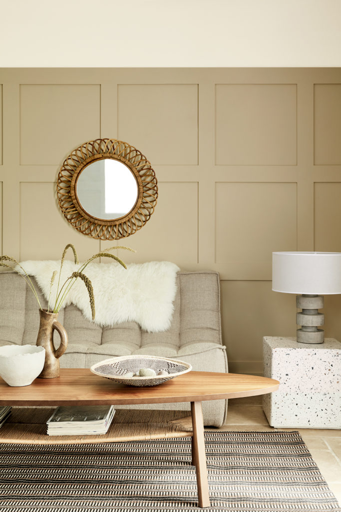
Neutral and Natural
Wood is always a favourite for both furniture and flooring. Natural stone, travertine or tiling work well in classic interiors. Or maybe you are going for a more contemporary or industrial look with textured or polished concrete. Accessories should also be warm and neutral, but play with finishes and depth of colour. Again, wood adds texture, whether it’s gnarled driftwood or a high gloss burl veneer.

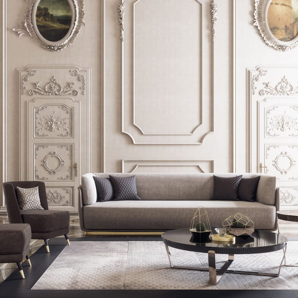
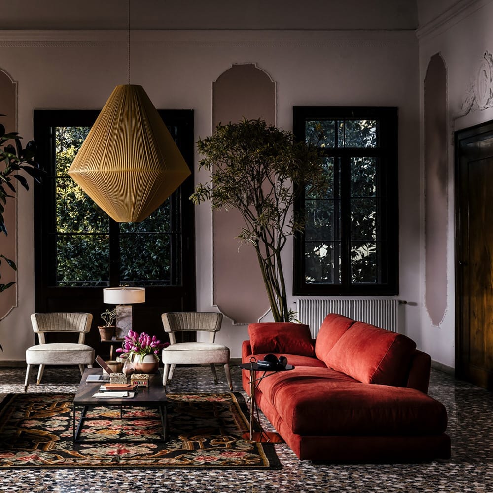
Warm Neutrals as a Backdrop
This is how we have traditionally used both cool and warm neutrals. It is a way of creating flexibility in your interior design. Warm neutral walls and floors act as your canvas. You then bring in colour with your furniture, soft furnishings and accessories. Most of us start by deciding on our main colour and then choosing warm neutrals that will harmonise with our main theme. Often, this will mean using just one or two shades of our warm neutral, with various shades and tones of our main colour acting as the star of the show. The beauty of using warm neutrals as a backdrop is that you can swap furnishings in and out to create a whole new look, without starting from scratch.
Using Accent Colours
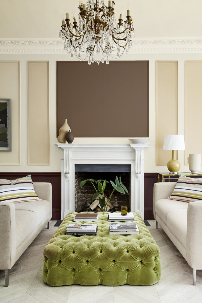
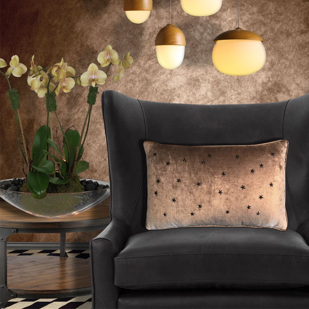
If you love the idea of an overall neutral theme but still have a craving for a bit of colour, this is probably the way to go. Choose your warm neutral palette depending on its base colour, and use lighter and darker shades within that group for walls, furniture, even larger items such as curtains. Then you can bring in small accents or pops of colour. This could be a cushion, a single chair, or a statement sofa. You may choose a vibrant rug, a colourful lamp or a small collection of accessories. A statuesque, architectural plant or two may be all you need or you could paint a single item in a strong, bold colour.
This is probably the most flexible way to use warm neutrals. Your accent pieces are generally small and easy to change. It gives you the option to change the whole look of a room depending on the season or just on a whim. It also lets you play with colour, knowing that if you change your mind, it’s easy to make over.
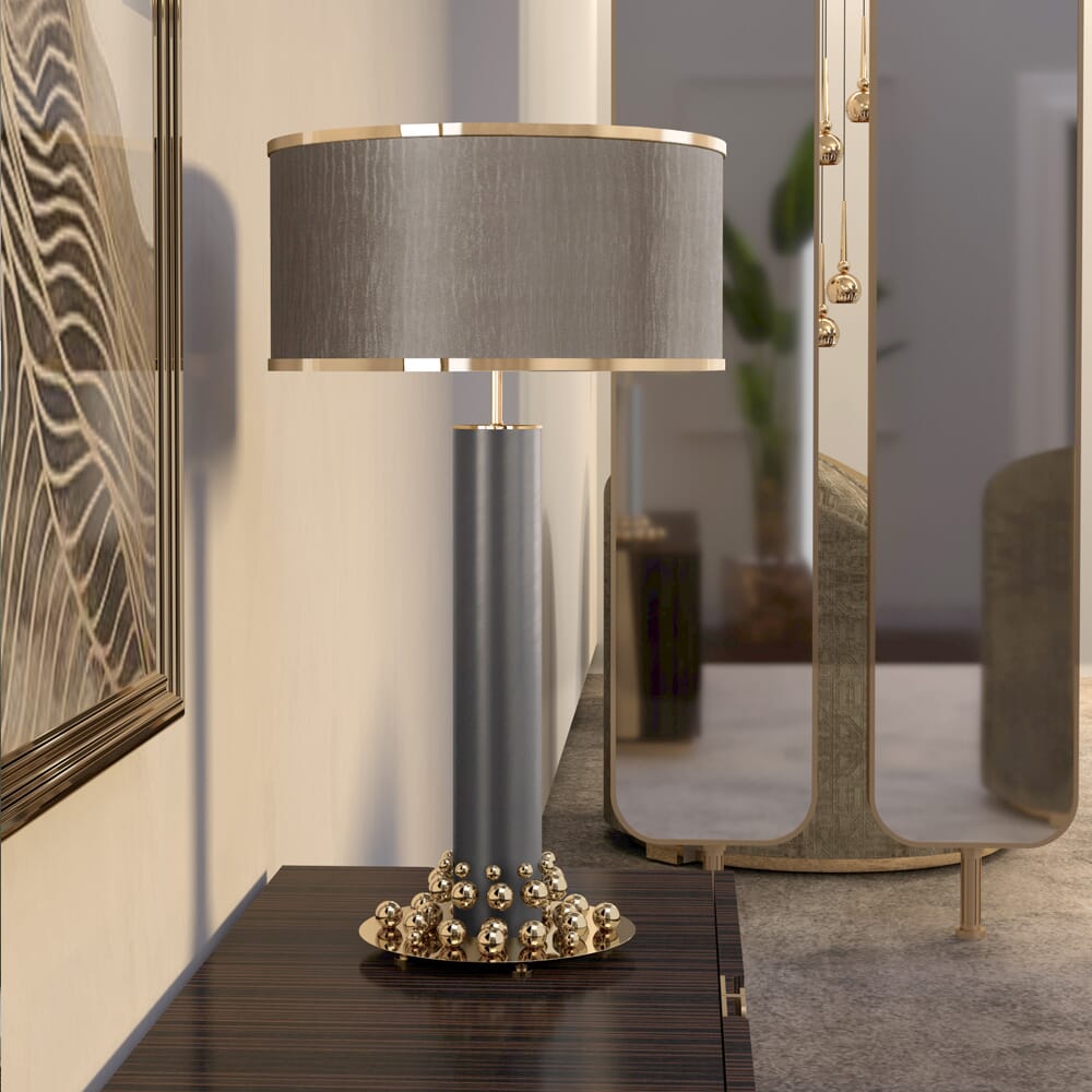
Metallics are Warm Neutrals too
No matter which approach you take, remember that metallics such as gold, bronze, copper and champagne are warm neutrals too. Whether you use gleaming, polished metals, a soft, brushed finish, an opulent gold leaf or a metallic fabric, do not underestimate the power of metallics to transform your interiors. Every room should have some metallic element. They gently bounce light to increase a feeling of space. At the same time, they add a layer of glamour, opulence and a welcoming warmth. We are seeing an increase in the use of metallic paints, either as a subtle finish on ceilings and walls or used as part of a spectacular, bespoke wall design. However you choose to use them, when it comes to warm neutrals, metallics really are your friends.
Learn About Colour Theory
If this is all too much to contemplate but you would really love to have a go, our Online Interior Design Course teaches the essentials not only of colour theory but also how to draw up accurate plans, create mood boards, choose furniture and lighting, work to a budget, arrange installation and manage your interior projects from beginning to end. Designing a room in your own home, you will finish the course with a completed design, ready to get started. If you would like to join our next online course, or just find out a bit more about it, click here for full information.
Interior Design Service
If you want a warm neutral interior but don’t want to tackle it yourself, give our talented interior design team a call. They can help you decide on colours, furnishings and fabrics. They are happy to advise on a single product or take on the complete interior design and installation process, including full project management, if that is what you want. We are only a phone call, email or LiveChat away.